Blue gray paint colors are having a deservedly long moment. They can make a bedroom feel quiet, give a small living room more depth, and bring a little structure to a kitchen without the heaviness of navy. But there is a catch: blue gray is not one color. Some shades look silvery and airy, while others lean slate, green, lavender, or almost denim once they are on the wall.
I learned this the annoying way in my first apartment. I bought a gallon of a pretty online gray-blue, painted one wall after dinner, and woke up to what looked like a chilly hospital hallway. The color itself was not terrible; it was simply wrong for my north-facing room and its cool LED bulbs. A sample board would have saved me a weekend and about $48. Start with what you love. The rest finds its place.
What makes blue gray paint colors work
Blue gray is essentially a softened blue with enough gray to make it livable. The gray lowers the saturation, so you get the emotional calm of blue without creating a room that feels themed. It is especially useful when you want color but are not ready for emerald, terracotta, or a deep dramatic blue.
The key is undertone. A blue gray with a green undertone can feel organic beside oak, rattan, linen, and warm white. A violet-leaning shade often looks elegant with charcoal, black metal, dusty rose, or burgundy. A clean, silvery blue gray feels crisp with white trim and brushed nickel, but it can look icy next to stark cool white.
Think about the fixed things you cannot easily change: flooring, countertops, the sofa, and large rugs. Paint should have a conversation with those pieces, not compete with them. If your floor has orange or honey tones, a slightly green or muted blue gray usually creates a more comfortable balance than an icy steel shade.
How light changes the color
Natural light is the boss of this decision. In a south-facing room, strong warm daylight can make blue gray paint colors look softer and more neutral. North-facing rooms receive cooler, bluer light, which can exaggerate the gray and make a pale shade look flat. East-facing rooms tend to feel bright in the morning and moodier later, while west-facing rooms do the reverse.
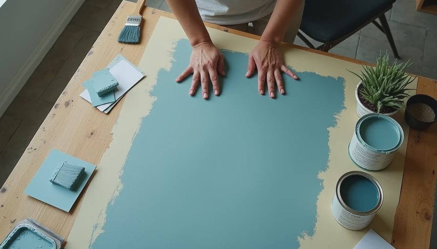
Do not test only on the wall beside a window. Paint a sample board at least 12 by 18 inches, or use large removable sample sheets, and move it around the room. Watch it in morning light, late afternoon, and evening lamp light. I like to leave a sample up for two full days. A shade that looks perfect at 10 a.m. can turn noticeably purple at 7 p.m.
Your bulbs matter, too. Warm bulbs around 2700K bring out beige and green notes; cooler bulbs can make a gray look bluer. You do not need to replace every light before painting, but test under the bulbs you actually use. This small step is more useful than staring at a tiny paper swatch in a store.
My favorite directions to explore
For a soft bedroom, look for a pale blue gray with a noticeable gray base. Benjamin Moore Gray Owl is a familiar example of a light neutral that can shift depending on the room, while Sherwin-Williams Misty is a gentler, misty direction. These shades work with white bedding, natural wood, and oatmeal-colored curtains without demanding a perfectly styled room.
For a more grounded living room, consider a medium slate blue gray. Sherwin-Williams Smoky Blue has enough depth to feel intentional, especially on built-ins or a single accent wall. Benjamin Moore Boothbay Gray is another popular direction: blue enough to read as color, but restrained enough for everyday furniture. Sample both before committing because their appearance changes dramatically with light.
If you want something moodier, move toward charcoal-blue rather than pure navy. A deep shade can make a dining room or office feel collected and intimate. Use it with warm lamps, brass or aged bronze, and lighter upholstery so the room feels layered instead of closed in. A gallon of quality interior paint often lands somewhere around $45 to $75, so testing two quart samples is cheaper than repainting an entire room.

Pairing walls with trim, furniture, and fabric
Blue gray paint colors become much easier to judge once you place them beside real materials. Bright white trim creates contrast and makes a medium shade look cleaner. Creamy trim softens the whole scheme and is often kinder to pale blue gray. If your home has existing builder-white trim that you cannot change, choose a color with enough warmth or saturation to avoid a chilly, disconnected effect.
Wood is a lovely partner because it adds heat. Medium oak, walnut, cane, and bamboo all keep blue gray from feeling sterile. For upholstery, try camel, rust, cream, olive, or faded denim. I would be cautious with too much cool gray furniture unless you deliberately want a quiet, monochromatic room. One gray sofa is fine; gray sofa, gray rug, gray curtains, and silver accessories can make the space feel like it has forgotten to wake up.
Pattern helps, even in small doses. A striped lumbar pillow, floral curtain, or vintage rug can repeat the wall color without matching it exactly. Look for a pattern that includes one warm color and one neutral. That connection makes the room feel designed rather than purchased in a single afternoon.
Choosing paint sheen and handling rentals
For most walls, eggshell is a practical choice. It has a soft amount of reflection and is easier to wipe than flat paint. Matte can look beautiful in a low-traffic bedroom but is less forgiving of fingerprints and scuffs. Satin is useful for trim, doors, and sometimes bathrooms, though its extra shine will emphasize uneven wall texture.
Renters can still use the blue gray idea without painting. A large removable mural panel, blue-gray linen curtains, a slipcover, or a painted bookcase can create the same color story. Try a temporary accent behind a desk or bed, where it reads as an intentional backdrop. Keep the original wall color in mind when selecting the shade; a warm beige wall beside a cool blue-gray panel may make the panel look bluer than it did in the store.
If you can paint, save the leftover quart with the room name and date written on the lid. Future touch-ups are much easier when you know which finish and color you used. I once kept a mystery can labeled “living room maybe?” for three years. It was not helpful.
A simple decision process before you buy
Begin with the room’s light and the furniture already staying. Then pull three samples: one lighter than your first instinct, one true middle option, and one deeper version. View them beside the floor, trim, and largest upholstered piece. Cross out anything that makes those fixed elements look dirty, pink, or aggressively blue.
Next, decide how you want the room to feel. For airy and restful, stay light and gray-forward. For cozy and tailored, choose a medium slate. For dramatic, go deep and give the shade breathing room with pale textiles and warm lighting. Blue gray paint colors are flexible, but they still need a clear job in the room.
Finally, buy the sample before the gallon. Paint one large board, live with it through a full day, and notice how it behaves when the room is messy and ordinary. That is the real test, not the carefully arranged product photo. The best blue gray paint colors are the ones that support your actual life: coffee on the arm of the sofa, laundry waiting on the chair, and a room that feels like yours when the styling is done.