Dark gray paint has a reputation for making rooms feel dramatic, moody, and slightly intimidating. I understand the hesitation. When I first considered it for my own living room, I pictured a cave with a sofa in it and Saffron, my orange rescue cat, looking like the only source of daylight. But the right dark gray paint can be one of the most livable colors in a home. It creates a quiet backdrop for wood, brass, linen, art, and the furniture you already own.
The trick is choosing the undertone and using enough contrast around it. Gray is never just gray. Some shades lean blue, some green, some violet, and some have warm brown undertones that make them feel almost taupe. Start with what you love. The rest finds its place.
How to Choose the Right Dark Gray Paint
Before buying a gallon, look at the room's natural light. A north-facing room receives cooler, flatter light, so a blue-based gray can turn noticeably chilly. A warm gray with brown or green underneath usually feels more forgiving there. In a sunny south-facing room, cooler dark gray paint can balance the golden light beautifully instead of making everything look yellow.
Paint samples are non-negotiable. Put large swatches on at least two walls, including the wall opposite a window. Watch them in the morning, afternoon, and after sunset with your lamps on. A shade that looks soft at noon can look nearly charcoal at 8 p.m. I also leave samples up for several days because my first reaction is often based on the color beside it, not the color itself.
Good starting points include Benjamin Moore Kendall Charcoal, Sherwin-Williams Peppercorn, and Farrow & Ball Down Pipe. These are not interchangeable, and each can shift depending on your flooring and bulbs. Kendall Charcoal often feels earthy, Peppercorn reads cleaner and deeper, and Down Pipe has a smoky blue quality. If you are shopping on a tighter budget, take a peel-and-stick sample to the paint counter rather than trying to match a phone screen.
Pairing Dark Gray Paint With Floors and Furniture
Dark gray paint is easiest to live with when the room contains a range of light and dark values. If every surface is deep gray, espresso brown, or black, the room can lose its shape. Bring in a pale rug, creamy curtains, or a lighter sofa to create negative space for the eye. Negative space simply means an area that gives the busier parts of the room somewhere to rest.
Warm wood is especially helpful. A walnut coffee table, oak shelves, or even a thrifted pine bench keeps a gray room from feeling cold. My own mid-century coffee table, Stan, looks considerably more expensive against a charcoal wall than it did against the old beige paint. The wall gives the wood a clear outline, while the wood gives the wall a little life.
For upholstery, try oatmeal, camel, rust, olive, dusty rose, or faded denim. These colors have enough body to stand up to dark gray paint without fighting it. White also works, but I prefer ivory or warm white because stark blue-white trim can make the whole palette feel commercial. If your room already has gray flooring, add contrast through texture: a nubby wool rug, woven baskets, linen pillows, or a visibly grained wood piece.
The Best Rooms for a Deep Gray Wall
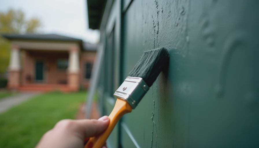
A living room is the obvious choice, but dark gray paint can do more interesting work in smaller spaces. In a dining room, it makes inexpensive artwork and secondhand furniture feel collected. In a bedroom, it can create a cocoon effect, especially with soft white bedding, amber lamps, and curtains that reach the floor. In a home office, the darker backdrop can make a desk, books, and framed prints feel intentional rather than scattered.
I am also fond of using this color in a hallway or on the lower half of a wall. A chair rail is not required; you can create a two-tone effect with painter's tape and a careful level. Keep the upper portion a warm off-white and use the deeper shade below. This is practical in an entryway because the darker section disguises everyday scuffs better than pale paint.
Renters have options, too. A removable wallpaper panel in a similar charcoal shade can give you the same visual weight without breaking a lease. You can also paint a large canvas or a pair of inexpensive plywood panels and lean them behind a sofa. It is not quite the same as painting the wall, but it creates a convincing color block and can move with you.
Lighting Matters More Than the Paint Chip
The most beautiful dark gray paint can disappoint under the wrong bulbs. I learned this after choosing a lovely shade for my bedroom and discovering that my old cool-white bulbs made it look faintly purple. Look for bulbs in the 2700K to 3000K range if you want a cozy residential glow. A 4000K bulb is crisper and can work in a workspace, but it often makes deep colors feel harsher at home.
Layer the lighting instead of depending on one ceiling fixture. A floor lamp beside the sofa, a small table lamp on a console, and a plug-in sconce near a reading chair will spread warm light around the room. Brass, aged bronze, and ceramic lamp bases add another layer of reflection. Mirrors help, but place them across from a window or lamp so they bounce actual light rather than simply showing a dark wall twice.
Gloss level matters as well. Matte or eggshell finishes hide minor wall flaws and make dark gray paint look soft. Satin is easier to wipe clean in a kitchen, hallway, or busy entry, but it reflects more light and reveals uneven patches. For most living areas, I would choose eggshell and spend extra time on surface preparation instead of buying the fanciest paint.
Common Mistakes to Avoid
The first mistake is choosing a shade from a tiny card. A two-inch chip cannot show you how a color behaves next to your sofa, floor, trim, and windows. The second is skipping primer on patched or very pale walls. Dark colors often need a tinted primer or two finish coats for an even result, particularly over glossy paint.
Another mistake is matching every accessory to the wall. A charcoal room does not need charcoal pillows, curtains, and art. That approach erases contrast and can make a modest room feel smaller. Repeat the wall color once or twice in the room instead, perhaps in a picture frame or patterned pillow, then let other colors do their work.
Finally, do not assume dark gray paint automatically looks modern. The surrounding shapes matter more than the color's reputation. Traditional trim, a vintage mirror, and a floral lampshade can make it feel collected. Clean-lined furniture and graphic art can make it feel contemporary. Paint is the background, not the entire personality of the room.
A Simple Plan for Your Own Room
Begin by photographing the room at three times of day. Notice where the light lands and which furniture pieces must stay. Then gather three samples: one warmer than your instinct, one cooler, and one true charcoal. Place them beside the flooring and your largest upholstered item. This comparison will tell you more than browsing hundreds of finished rooms online.
After choosing a sample, calculate your wall area and buy enough paint for two coats rather than trying to stretch one. Remove switch plates, clean dusty walls, and tape carefully around trim. Let the first coat dry fully before deciding whether the color is working; wet paint is unreliable, and dark shades can look uneven while drying.
Give the room contrast before you judge it. Bring in a lamp, rug, art, and at least one warm wood or woven piece. If the result still feels heavy, you may not need a new color. Try brighter bulbs, lighter curtains, or a larger mirror first. Those changes cost far less than repainting and often solve the actual problem.
Dark gray paint is not a commitment to a gloomy home. It is a strong background that can make ordinary pieces feel considered and help a room develop some visual confidence. Test generously, pay attention to undertones, and let your own furniture lead. Start with what you love. The rest finds its place.