If you keep circling back to dark olive green, you are probably after a color that feels grounded, a little moody, and a lot more interesting than beige. I get it. It has that borrowed-from-nature look that can make a room feel settled without turning it into a farmhouse cliché. It also plays well with the kind of furniture most of us actually own: walnut dressers, cream sofas, brass lamps, thrifted wood frames, and rugs that have seen a few real-life spills. The trick is using it with enough light, contrast, and texture that it reads intentional instead of muddy.
Why it feels richer than a standard green
The reason dark olive green works so well is that it sits in the middle of several moods at once. It has the earthiness of brown, the calm of green, and just enough depth to make white trim or ivory upholstery look cleaner. That is why it feels more collected than a bright jewel tone and less precious than a true emerald. In a room with sunlight, it softens. In a room with low light, it gets moodier, which can be a good thing if you want the space to feel like a place to exhale.
This color also hides a little life better than people expect. A velvet pillow in a dusty shade looks chic even after a few weeks of use, and a painted accent wall gives you more visual weight than a pale sage ever will. If your apartment already has beige carpet, builder-grade trim, or a boring ceiling, this is one of the easiest ways to add personality without changing every single thing around it.
The reason dark olive green feels expensive is not because it is flashy. It is because it gives a room some visual gravity. It anchors a space the way a good navy does, but it feels a little warmer and more relaxed.
Start with one piece, not the whole room
If you are nervous, start with dark olive green in the smallest, easiest places. A throw pillow is the cheapest test, and a good one usually costs between $18 and $45 depending on fabric and size. A knit throw can run $40 to $80, while a painted accent wall costs far less than a full room makeover if you are doing the labor yourself. I like this route because it lets you see the color at different times of day before you commit to a sofa, curtain panel, or painted built-in.
A few smart first moves: swap in a pillow cover, hang a curtain panel on one side of the window to compare against your wall color, or bring home a vase, lamp base, or storage basket in the shade. If the color makes your existing wood warmer and your whites cleaner, you are on the right track. If it makes everything look yellow or flat, the undertone in the room is fighting back. That is useful information, not a failure.
For renters, this is the friendliest way in. You can get the same grounded feeling from fabric and accessories without asking your landlord for permission.

Pair it with the colors that keep it honest
The easiest partners for dark olive green are colors that create a little breathing room around it. Cream, linen, warm white, caramel, tobacco brown, and muted rust all help it look rich instead of dense. If you like a cleaner look, black accents can sharpen the edges, especially in lamps, frames, or metal curtain rods. Brass does something similar, but softer. It keeps the palette from feeling chilly.
I would be careful with icy gray. It can flatten the whole scheme and make the green feel more military than cozy. Cool blue can work, but only if you want the room to feel tailored and slightly formal. For most homes, a better mix is one deeper tone, one soft neutral, and one small accent color that feels lived in. Think cream sofa, olive pillow, walnut side table, and a little rust in the art or a vase. That combination looks finished without needing a designer budget.
If you want the room to lean a little warmer, add aged leather, terracotta, or an oatmeal texture. That keeps the palette grounded and helps the color feel more like a backdrop than a statement.
Use texture so the room does not go flat
With dark olive green, texture does the real work. A flat paint on every surface can make the color feel heavier than it needs to be, especially in a small space. But when you mix matte walls, a nubby linen shade, a woven basket, and a velvet cushion, the eye has places to land. The color starts to feel layered instead of one-note.
This is where fabric choice matters. Velvet makes the shade look deeper and more polished. Linen makes it easier and more casual. Boucle or slubby cotton keeps it from looking too sleek. Even a simple ceramic lamp with a matte finish can change how the color reads in the room. If you have a lot of smooth surfaces already, like lacquered furniture or glossy tile, bring in something soft so the space does not feel cold.
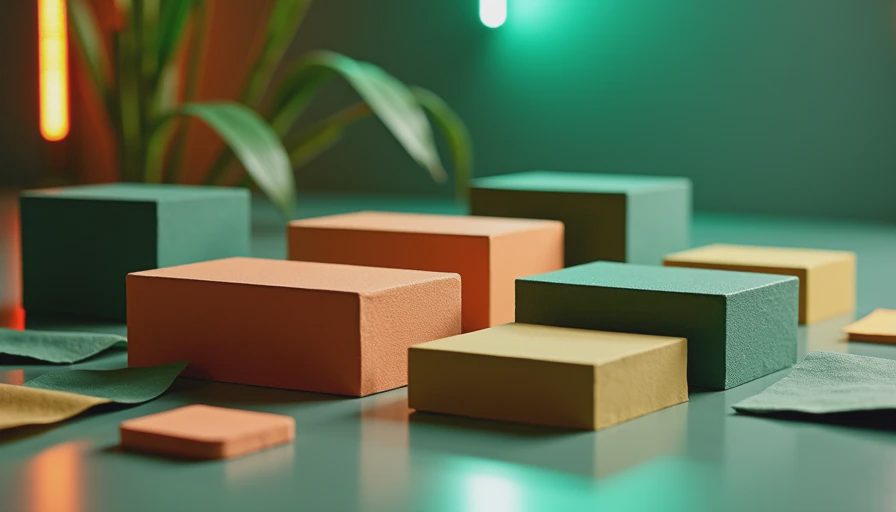
A small apartment can still handle it
A lot of people worry that a dark color will shrink a room, but that is only half true. A room feels smaller when everything is the same value and nothing has contrast. A small apartment can handle dark olive green if you give it a few lighter breaks. That could mean white curtains, a pale rug, open leg furniture, or even a big mirror across from the window.
In my own apartment, I would use it on a lower dresser, a reading chair, or one wall behind art before I painted all four walls. That gives you the mood without swallowing the room. If your ceilings are low, keep the top half lighter. If the room already gets good daylight, you can push it further. The point is to let the color support the furniture, not fight it.
This is also a good shade for rooms that need to do more than one job. It can make a dining nook feel more intentional, or a bedroom feel calmer at night. Start with what you love. The rest finds its place.
The mistakes I see most often
The biggest mistake is using dark olive green with too many cool or sharp finishes. Chrome, bright white, and blue-white lighting can make it look harsher than it should. Another common issue is treating it like a neutral and forgetting contrast. If the sofa, rug, walls, and art all sit in the same dark range, the room can feel sleepy instead of cozy.
The fix is usually simple. Add one lighter surface, one natural material, and one warm accent. If the color still feels off, it may not be the shade itself. It might be the undertone in your flooring, the temperature of your bulbs, or the fact that the room needs more daylight. A warm LED bulb in the 2700K range can do more for the mood than another pillow ever will.
If you want a room that feels calm, a little stylish, and easy to live in, dark olive green is a strong place to start. It is not loud. It does not need to be. It just gives a room enough depth to feel like somebody actually lives there, and likes it that way.