If you have ever wondered what are neutral colors, the answer is simpler than the internet makes it sound. They are the shades that sit back and let the room breathe: white, ivory, cream, beige, taupe, gray, greige, soft brown, and even muted black. The trick is that neutral does not mean boring, and it definitely does not mean one lonely shade of builder beige. In a good room, neutrals act like the background music. They set the mood, support the furniture, and make the details you actually care about feel sharper.
I reach for neutrals when a space needs calm without feeling flat. They are the easiest place to start if you are choosing a sofa, a rug, or wall color on a budget because they mix with almost anything. A warm oatmeal sofa can live next to a walnut table, a black floor lamp, and a striped pillow without fighting for attention. That flexibility is why so many rooms look expensive even when the pieces came from Target, IKEA, or a Facebook Marketplace pickup.
What are neutral colors in a room, really?
In decorating, neutral means a color with low visual drama. It does not have to be pale, and it does not have to be warm. Charcoal counts. Deep brown counts. Soft mushroom counts. Even a muted olive can behave like a neutral if it is quiet enough to support the rest of the room. That is why designers talk about undertone so much. A cream with a yellow undertone feels sunny. A gray with a blue undertone feels cooler and a little sharper. Same basic family, very different mood.
The easiest way to think about neutrals is to divide them by temperature and value. Temperature is whether they lean warm or cool. Value is how light or dark they are. A room built from light neutrals feels airy and open. A room built from darker neutrals feels grounded and tailored. You do not need to memorize a color wheel to use this well. You just need to notice whether the room is already warm from wood, brass, and afternoon light, or cool from tile, silver finishes, and northern exposure.
Warm neutrals versus cool neutrals
Warm neutrals include ivory, cream, camel, sand, beige, tan, oatmeal, and many soft browns. They work beautifully with oak floors, antique brass, terracotta, linen, and the kind of casual furniture that looks better slightly rumpled. If your apartment gets cold light, warm neutrals can keep it from feeling like a doctor’s waiting room. Sherwin-Williams Accessible Beige, Benjamin Moore Swiss Coffee, and White Dove are popular because they stay soft without going yellow on most walls.
Cool neutrals include pale gray, stone, slate, mushroom, and some crisp whites. They pair well with black metal, polished nickel, marble, glass, and rooms that already have a lot of warm wood. Benjamin Moore Classic Gray and Revere Pewter sit in the middle enough to work for people who want something quiet but not icy. If you are nervous, bring home sample pots first. Those little tester cans usually cost around $4 to $10, which is cheaper than repainting a whole room because the undertone surprised you.
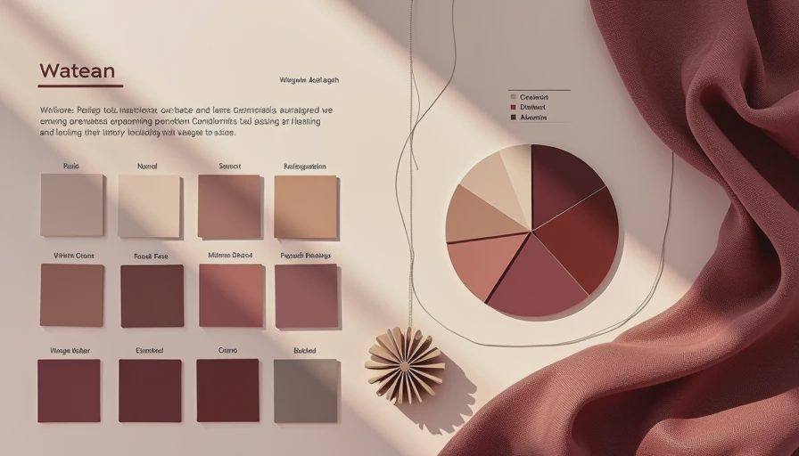
How to build a palette without making everything beige
The fastest way to make a neutral room feel intentional is to mix texture and value, not just color. A linen curtain, a nubby wool rug, a matte ceramic lamp, and a smooth wood table can all live in the same soft palette and still look layered. If everything is the same shade and the same finish, the room goes dead fast. You want a little contrast: light against dark, rough against smooth, matte against shiny. That is what gives neutrals their shape.
A simple formula helps. Start with one main neutral for the biggest surfaces, like walls or sofa. Add a second neutral in a slightly deeper or cooler tone for the rug, drapes, or accent chair. Then give the room one dark anchor, maybe a black frame, espresso side table, or charcoal pillow. That small dose of contrast keeps the room from turning into a hotel breakfast nook. If you like color, you can still add it. Rust, sage, dusty blue, and olive all sit nicely inside a neutral base.
The best starter shades for renters and first homes
If you are decorating your first place, do not overcomplicate it. Pick a wall color that plays well with your floor and the biggest fabric in the room, usually the sofa or rug. For many renters, a soft warm white is the easiest reset because it brightens everything without looking stark. For a little more depth, greige is the sweet spot. It can hide more than a pure white wall, and it feels less sterile in small rooms. That is why colors like Pale Oak, Accessible Beige, and Edgecomb Gray show up in so many real apartments.
For furniture, I usually tell people to buy the neutral version of the piece they will live with the longest. A beige or gray sofa is easier to style than a bright accent color, and a neutral rug gives you more freedom later when your taste shifts. If you are shopping secondhand, look for natural fibers, solid wood, and upholstery in a tone that does not fight your walls. A $250 used chair in a good neutral often beats a new trendy piece that will annoy you in six months.

Where neutral rooms go wrong
The number one mistake is not using enough contrast. A room with beige walls, a taupe sofa, a tan rug, and cream pillows can look muddy if everything lands in the same middle range. Another common miss is ignoring undertone. Put a pink-beige next to a green-gray and one of them will suddenly look dirty. Lighting matters too. Morning sun, north-facing daylight, and yellow bulbs all change how a neutral reads. A color that looks soft at noon can feel dingy after dinner.
The fix is usually simple. Add one darker element, one lighter element, and one natural material with some character. Think black lamps, ivory curtains, wood grain, leather, rattan, or a vintage brass bowl. Those pieces give a neutral room depth without adding noise. Start with what you love. The rest finds its place, and that is especially true when you are trying to make a home feel finished without buying everything at once.
A simple way to test your neutrals before you commit
This is the part I wish more people did before hauling home ten sample boards and hoping for the best. Put your swatches on a white sheet of paper and tape them to the wall near your rug, sofa, and window. Check them in the morning, afternoon, and at night with the lamps on. A neutral that looks perfect in bright daylight can go strangely green in the evening, and a warm beige can read almost peach if your bulbs are too yellow. That is not a failure. That is color doing what color does.
If you are choosing between two almost-identical shades, pick the one that works hardest with the biggest item already in the room. The wall color should flatter the floor. The rug should flatter the sofa. The curtains should make the window feel cleaner. Once you know what are neutral colors, you stop treating them like the safe option and start using them like a design tool. They give you flexibility, calm, and a room that still feels like you when the trend cycle moves on.