If you've ever stared at a swatch of plum or lavender and wondered which colors that go with purple actually make the room feel calm instead of chaotic, you're in the right place. Purple is one of those shades that can look expensive fast, but only if you give it the right neighbors. In a living room, bedroom, or even a tiny rental office, the trick is to decide whether your purple wants to feel soft, moody, or crisp, then let everything else follow that lead. Start with what you love. The rest finds its place.
Start with the purple you already have
Not every purple behaves the same way. A dusty lilac with a gray cast reads very differently from a rich eggplant that leans red. That matters more than people think, because the right partner color depends on whether your purple feels cool or warm. If your shade looks bluish, keep nearby colors cooler too: soft white, stone, silver, charcoal, and clean-lined black all make it feel intentional. If your purple has a red or berry undertone, it usually plays better with cream, camel, walnut, brass, and soft blush. That is the part most room boards skip, and it is why one purple bedroom looks polished while another feels like a costume.
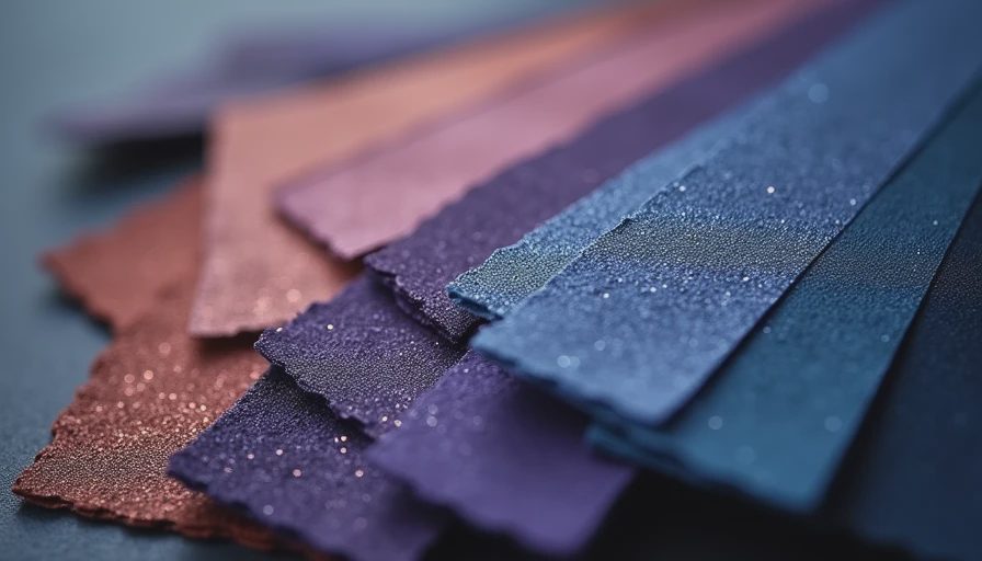
Think of it the way you would choose jewelry with an outfit. A cool purple loves crisp metal and a little contrast. A warmer purple likes something with softness and depth. This is also where texture starts doing real work. Velvet, linen, bouclé, and matte paint can keep the color from feeling flat. A plum pillow on a linen sofa looks calmer than the same pillow on shiny satin. A lavender throw with a nubby weave feels more grown-up than a glossy one from a discount bin.
Colors that go with purple when you want a calm room
If your goal is a room that feels restful, the easiest wins are ivory, oatmeal, mushroom, pale gray, and soft sage. These are the colors that go with purple when you want the purple to be the interesting note instead of the whole song. They give the eye a place to rest, which is exactly what a bedroom or reading nook needs.
Cream walls with a lilac quilt can feel airy and still a little romantic. A mushroom rug under a grape-toned chair keeps the setup from getting sugary. Pale sage beside muted violet is especially nice in daylight, because the green quiets the purple without making the room cold. If your space gets strong afternoon sun, soft gray can help hold everything together. I like this approach for renters because it is easy to build with a $25 pillow cover, a $60 throw blanket, and a lamp you already own.
A small brass detail helps too. One picture frame, one table lamp, or one curtain rod in brass gives a purple-and-neutral room a little edge without making it fussy.
Add contrast without making the room feel loud
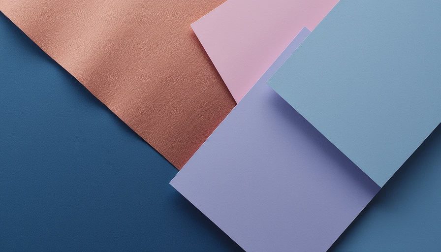
Once you want a little more personality, go darker. Charcoal, navy, ink black, forest green, and rust all give purple structure. They make lavender look fresher and eggplant look richer. This is especially good if you are working with a large rug, a headboard, or one statement chair. A deep purple velvet chair next to a black floor lamp feels deliberate. The same chair next to every pastel in the room starts to look accidental.
Navy is one of the most useful partners because it gives purple a tailored feel. It works well in bedrooms with white bedding and one plum accent pillow. Charcoal is better when you want the room to stay quiet and a little moody. Forest green is a pretty surprise with warm purple, especially if you repeat it in plants or art. Rust and mustard are bolder, so keep them smaller: a lumbar pillow, a ceramic vase, a framed print. If you add too much of either, purple can start fighting for attention instead of anchoring the room.
How to mix purple into a real room without overthinking it
The easiest way to use purple is to let it show up in one big thing and one or two smaller things. For example, a lilac duvet, two cream pillows, and a walnut nightstand already feel finished. A plum area rug, a gray sofa, and a black coffee table do the same job in a living room. You do not need every object to be part of the same family; you just need the colors to share a job.
This is where paint and textiles matter more than decor clutter. A rental bedroom with white walls can take a purple quilt, a tan throw, and a sage lamp base and feel layered without being busy. In a living room, purple curtains against warm white walls can look amazing if the rug stays neutral and the art picks up one darker accent. If you are shopping, I would rather you spend $90 on a better throw than $90 on three tiny purple objects that disappear the second you walk past them.
The other thing people forget is lighting. Warm bulbs make purple look cozier and more saturated. Cool bulbs can make it look blue or a little flat. If your room feels off, try the bulb before you blame the sofa.
A renter-friendly formula that keeps the palette balanced
If you want a simple starting point, use a base of one neutral, one supporting color, and one accent. In practice, that might look like oatmeal walls, a lavender rug, and a charcoal lamp. Or ivory bedding, a plum pillow, and a brass mirror. Keep the biggest surfaces quiet, then let purple show up where the eye naturally lands. That gives you color without making the room feel crowded.
Shoppers on a budget can build this look with pieces from Target, IKEA, HomeGoods, World Market, or West Elm when there is a sale. Pillow covers often land around $20 to $45, decent throw blankets can run $30 to $80, and a good-looking rug is usually the splurge, especially once you size up to an 8x10. If you are decorating one room at a time, start with the item you touch most often, like bedding or a sofa throw. That one choice will steer everything else more than a cart full of small decor ever will.
The mistakes that make purple feel harder than it is
The most common miss is using too many purples at once. Lavender walls, grape pillows, plum art, and violet candles can look charming in theory and muddy in real life. Pick one hero shade, then support it with quieter colors and a few grounding materials. Another miss is ignoring undertone. A cool purple next to beige that leans pink can feel slightly off, even if both colors are pretty on their own.
The last mistake is skipping texture. Purple needs help from linen, wood, wool, ceramic, or matte metal to feel collected. Without those surfaces, it can read flat and a little juvenile. With them, it gets depth fast. When you remember that colors that go with purple only need one clear lead actor, the whole room gets easier. Start with what you love. The rest finds its place.