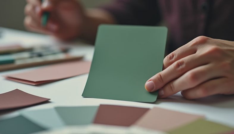
If your place feels a little loud in all the wrong ways, calming colors can change the whole mood without a full remodel. I mean the kind of change you notice when you walk in with groceries, drop your keys, and realize your shoulders unclenched somewhere between the hallway and the sofa. That is the real goal: a room that lets your eye rest and still feels like a person lives there.
What actually reads as restful
Calming colors are usually low-drama shades with some softness in the undertone. Think warm whites, misty blues, mossy greens, dusty taupes, and gray-beiges that lean gentle instead of cold. They do not have to be pale to work. A deep olive or a muted slate can feel soothing if the tone is quiet and the room has enough light around it.
What makes a color feel restful is usually three things: value, undertone, and contrast. Light colors reflect more light, so they naturally feel airy. Cooler undertones can read crisp, but if they get too icy they start feeling sharp. And if every surface is fighting for attention, even a lovely paint color can feel busy. I like to think of it like a good outfit. One strong piece, a few supporting pieces, and room to breathe.
If you are starting from scratch, pull a mood board with one wall color, one fabric, and one wood tone. That small trio will tell you more than a dozen Pinterest screenshots ever will.
Start with the room's job
Before you pick a swatch, ask what the room is supposed to do. A bedroom can go softer and darker because its job is sleep. A living room needs enough warmth to feel friendly at 5 p.m. when the lamps go on. A home office benefits from a color that keeps you focused without feeling stark, which is why so many people land on soft green, warm white, or a blue-gray that does not shout.
This is where people get tripped up. They choose a favorite color from a tiny chip, then wonder why the room feels off once the couch, rug, and curtains show up. The walls are only one layer. In a small apartment, the ceiling, trim, and big fabric pieces count just as much. If your sofa is charcoal and your rug is a cool pattern, a creamy wall can soften everything. If your furniture is mostly warm wood, a flat gray-white can make the room feel unfinished.
The easiest fix is to match the mood, not the exact color family. Warm with warm. Cool with cool. Then adjust one step softer than you think you need.

The easiest palettes to live with
When I am helping someone narrow down calming colors, I usually start with a few palettes that are hard to mess up. A warm white with beige undertones works almost anywhere, especially if the room gets limited sun. Benjamin Moore Pale Oak and Sherwin-Williams Alabaster are popular for a reason: they look clean without turning sterile. If you want more color, try a muted blue-green like Sea Salt or a gray-green that feels like weathered stone rather than mint.
For bedrooms, I also love dusty lavender-gray, soft sage, and clay-tinted neutrals. They feel quiet but still have personality. A color like Farrow & Ball Skimming Stone or Accessible Beige can be a nice middle ground if you want warmth without the yellow cast that some beiges pick up. In a rental, even a single accent wall or a large fabric change can move the mood in the right direction.
The trick is to keep the palette tight. One main wall color, one secondary tone in textiles, and one deeper anchor, like walnut wood or black metal, usually feels finished without getting fussy.
How to test paint and fabric
Calming colors look different at 8 a.m., 2 p.m., and after dark, so test them where you actually live. Paint a sample board at least 18 by 24 inches, or use peel-and-stick swatches if you are trying to avoid the whole primer-and-paint situation. Put the sample next to your sofa, rug, curtains, and flooring, not just against a blank wall. A color that looked perfect at the store can go pink, green, or muddy the second it meets your trim.
I also like to test with fabric. Toss a throw pillow, blanket, or curtain panel into the room and leave it there for a full day. If you have a north-facing room, the color will usually feel cooler. South-facing light is friendlier and can flatter a wider range of tones. If your room is dim, the safest move is usually a warmer version of the shade you think you want.
When you are narrowing down calming colors, compare them in real life, not under store lighting. The winner is rarely the one that looked most exciting on a chip. It is the one that still looks good when the lamp is on and the laundry basket is in the corner.

Mistakes that flatten a space
The most common mistake is picking a shade that is technically soft but emotionally dead. That happens when everything in the room is the same middle value. Beige walls, beige rug, beige sofa, beige curtains, and suddenly the whole space feels like cardboard. Restful does not mean flat. You still need contrast in texture and a little depth in at least one place.
The other problem is going too gray. A lot of people think gray automatically equals calm, but a cool gray in the wrong light can feel like a rainy Tuesday with no coffee. If you want a safer route, look for green-gray, blue-gray, or taupe with warmth in it. Those tend to feel more human.
Texture helps more than people expect. Linen curtains, a nubby wool rug, a glazed ceramic lamp, and a wood side table can make soft color feel intentional instead of washed out. That is especially useful if you rent and cannot change the architecture. Start with what you love. The rest finds its place.
A simple room-by-room roadmap
In a bedroom, start with the softest version of the palette and let bedding do the talking. In a living room, choose a wall color that supports your biggest piece, then repeat it in one or two accessories so the room feels connected. In a bathroom, a creamy white or pale green can make builder-grade tile look less harsh. And in a dining area, even a muted olive or smoky blue can create a little atmosphere without making the room feel heavy.
If you want calming colors that still feel current, keep the palette grounded in real materials: oak, linen, stone, brass, and matte ceramic. Those finishes make almost any soft shade feel richer. You do not need a perfect designer scheme. You need a color story that works with your light, your furniture, and your daily life.
If you are stuck, pick one room and test three swatches for a week. Live with them. Watch them next to your morning coffee and your evening lamp. The right choice usually makes itself obvious before the paint ever goes on the wall.