If you've ever stared at a sage pillow and wondered why it feels flat, the green complementary color is the missing piece. On a color wheel, green sits opposite red, which is why a little rust, brick, coral, or cranberry can suddenly make a room look awake instead of muddy. I use that trick all the time in my own apartment, especially when Olive, my velvet green sofa, starts looking too polite with the rest of the room. You do not need a Christmas palette. You need balance, a little contrast, and one color that wakes green up instead of fighting it.
What the green complementary color actually is
The green complementary color is red, but in real rooms that does not mean you have to drag home a stop sign. Think of it as a family of red-based shades: rust, terracotta, brick, burgundy, oxblood, rose, and coral. Those versions do the same job with less drama. They give green a little tension, which is what makes both colors look richer. If everything in a room is soft, the eye gets bored. If everything is loud, the room gets tired fast. The sweet spot is usually one strong green, one softened red-based accent, and a neutral to keep the whole thing from tipping into themed territory.
A good example is a moss pillow on a cream chair with a rust throw draped over one arm. Nothing about that setup feels complicated, but it reads intentional because the colors have a reason to be there. That is the whole game.
How to use it without making the room feel loud
I like to use contrast in small doses first, then build if the room needs more personality. A pair of throw pillows can be enough. So can a lamp shade, a framed print, or a blanket folded at the end of the bed. If you are decorating on a budget, this is one of the cheapest ways to make a room feel like it was planned instead of assembled from clearance bins.
Pillows usually run from about $25 to $60 each if you shop Target, H&M Home, or HomeGoods. A decent lamp shade might be $40 to $120. Framed art can climb higher, but you can get a strong effect with a $30 print and a simple frame from Ikea. The point is not to buy a whole new room. The point is to give the room one clear color conversation.
The best shades to pair with green
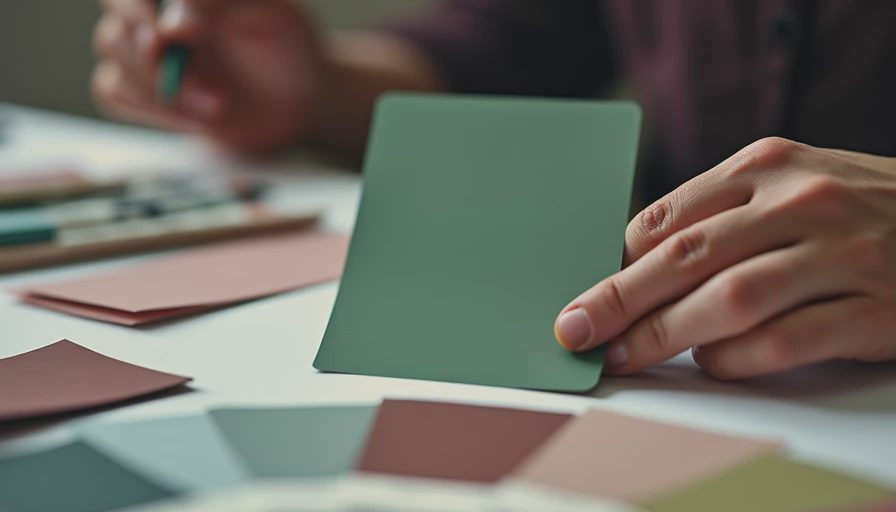
The green complementary color looks different depending on which green you started with. Sage likes dusty rose, blush, and muted terracotta because those colors keep it airy. Olive is a little earthier, so rust, clay, camel, and warm brick usually look better than bubblegum pink. Emerald wants more depth. I reach for burgundy, oxblood, plum, or a deep coral when I want emerald to feel rich instead of costume-y.
If you want a softer look, lean into worn-in versions rather than bright ones. Think tomato, not fire-engine red. Think clay, not neon coral. That softer edge is what makes the pairing feel like a home, not a holiday aisle. In a room with a lot of natural wood, even a tiny amount of red-based color can be enough because the brown tones help bridge the contrast.
Materials that make the pairing feel finished
Color is only half the job. Texture is what keeps the pairing from reading flat. A green velvet pillow beside a rust linen throw looks more expensive than two shiny fabrics in the same colors. Boucle, wool, ceramic, cane, brushed brass, and walnut all help, because they break up the color story and give it some shape.
This is where people usually overspend in the wrong place. They buy a pricey accent color and then put it on the wrong material. A $45 pillow in velvet can look better than an $85 pillow in a stiff, slick fabric. Same with curtains: a soft linen panel in a red-based shade will usually feel calmer than a glossy polyester version. If you want the room to feel layered, mix one plush thing, one matte thing, and one hard surface.
A favorite formula in my own place is green velvet, rust linen, and a brass lamp. It sounds simple because it is. Simple is not the same as boring.
Common mistakes that flatten the room
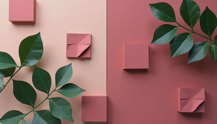
The biggest mistake is using full-strength red and full-strength green together with no breathing room. That can look holiday-ish fast, especially in a small room with not much natural light. The second mistake is ignoring undertone. A cool green usually prefers cleaner, softer red-based accents like blush, rose, or burgundy. A warm green tends to play better with clay, rust, and brick. If the undertones are fighting, the whole room feels off even if you cannot explain why.
I learned that the hard way with a coral pillow I bought on sale. It looked gorgeous online, but next to my olive chair the orange in it was too bright, and the whole corner felt like it was shouting. I kept the pillow for the guest room and swapped in a deeper rust shade. Problem solved. The third mistake is spreading the contrast everywhere. Pick one or two hero moments and let the rest of the room support them.
A room-by-room cheat sheet for real homes
In a living room, start with one green sofa or chair, one rust or brick pillow, and a neutral throw. If the sofa is neutral, reverse it and let the green show up in the pillows or a chair. In a bedroom, try green bedding with a soft red-based lumbar pillow, or use a green headboard with terracotta bedside lamps. In a kitchen, towels, a runner, and even a bowl of apples can carry the idea without a renovation.
For renters, this is a gift. You can test the whole color story with textiles and art before you commit to paint. If you love the result, you can add more later. If you do not, you have not sunk the budget into anything permanent. That is the part I always tell friends first: start small, look at it in morning light and at night, and then decide if it needs one more layer or if it is already doing enough. A green complementary color works best when it looks like you picked it on purpose, not because you were trying to match everything in the cart.
Start with what you love. The rest finds its place.