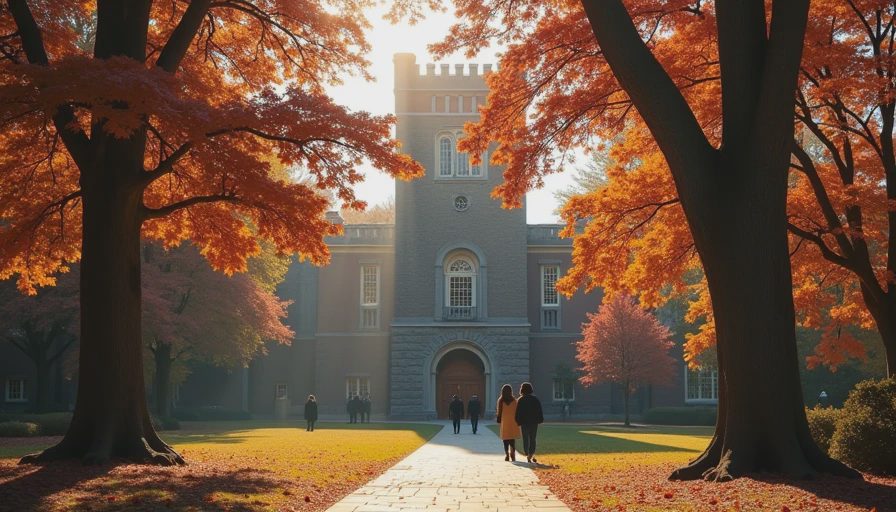
There is a specific, quiet magic that descends upon Princeton, New Jersey, every October. When the crisp autumn air rolls through Nassau Hall and the historic ivy-covered stone walls begin to flush with deep crimson and burnt orange, the entire campus transforms into a living, breathing masterclass in color theory.
For years, I used to walk through the university gates simply enjoying the scenery. But ever since I started looking at interior design through the lens of a graphic designer and home decorator, my perspective changed entirely. I stopped seeing just "pretty fall leaves" and started taking mental—and literal—notes on sophisticated, nature-tested color combinations.
If you want to bring the grounding, poetic warmth of an Ivy League autumn into your living space without making it look like a tacky seasonal craft store, you need to steal these three color pairings directly from Princeton’s campus.
“Start with what you love. The rest finds its place.”
1. The Gothic Stone & Burnt Rust Pairing
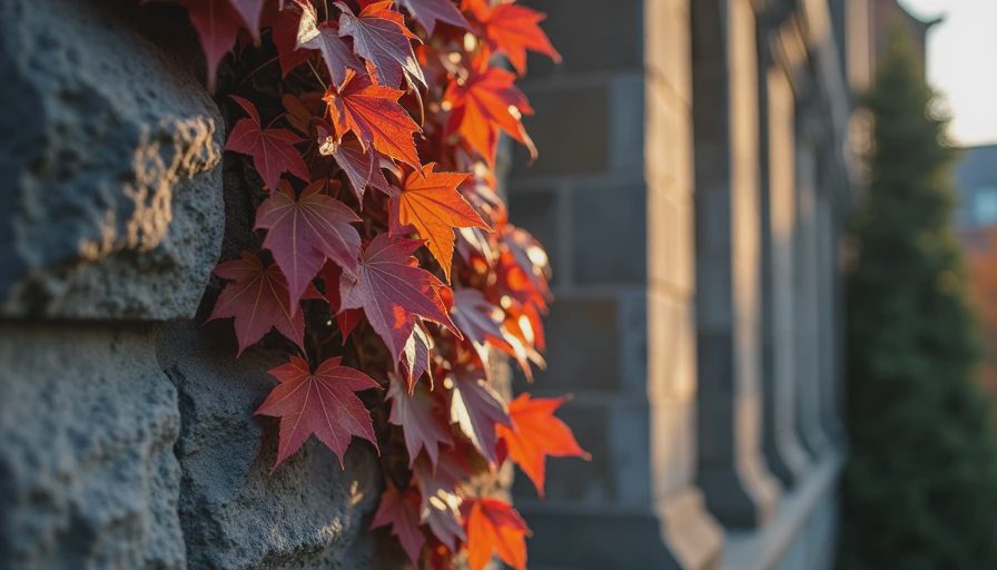
Take a close look at Princeton’s iconic campus architecture. You will notice a striking interplay between the cool, weathered grey of the centuries-old Gothic stone and the blazing, energetic punch of crimson ivy crawling up the facade.
The Palette: Slate grey, aged limestone, and deep burnt rust (or rich terracotta).
How to translate it to your home: Cool, neutral bases—like a soft greige wall or a pale concrete-effect floor—provide a sophisticated, calming canvas. Against that quiet backdrop, introduce rich, fiery accents: a burnt rust wool throw blanket, terracotta pottery, or a deep rust velvet cushion. It balances cool architectural restraint with organic, warming energy.
The Design Effect: This combination prevents a room from feeling overly heavy or monochromatic. The grey grounds the space while the rust injects life, echoing the fleeting brilliance of changing leaves against ancient architecture.
2. The Ivy Green & Brushed Brass Pairing
Walk down any pathway framed by historic academic buildings in late autumn, and you’ll witness a timeless masterclass in contrast: deep, saturated hunter greens set against antique brass lanterns, heavy iron hinges, and golden fallen leaves.
The Palette: Rich ivy green, antique brass, and muted gold.
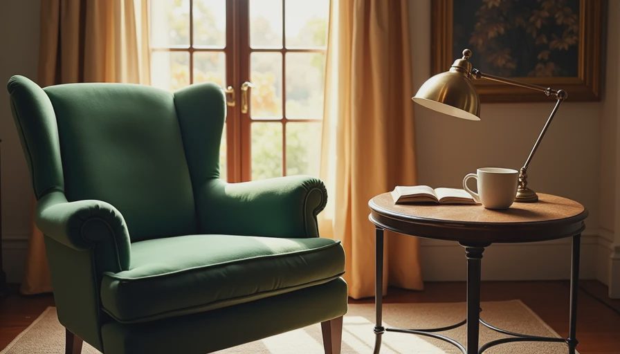
How to translate it to your home: Green is grounding, but when paired with shiny modern chrome, it can feel cold. Swap the chrome for warm, brushed brass or aged gold hardware, picture frames, and lighting fixtures. Pair an olive or hunter green accent piece (like a velvet armchair or painted bookshelf) with these metallic accents to instantly create an atmosphere of quiet luxury and academic heritage.
The Design Effect: It mimics the natural interplay of sunlight filtering through dense foliage. The metallic gold picks up ambient light, ensuring that deep green tones read as cozy and rich rather than dark or gloomy.
3. The Decayed Oak & Cream Parchment Pairing
If you wander past Blair Arch on a breezy morning, you’ll find pathways littered with fallen oak leaves in shades of toasted walnut and taupe, contrasting sharply with the crisp, clean white trim of historic window sashes and old manuscript pages.
The Palette: Toasted walnut wood, warm taupe, and crisp cream parchment.
How to translate it to your home: This is the ultimate antidote to sterile, minimalist white-box apartments. Ground your living room with rich, raw wood tones—like a vintage oak coffee table or walnut sideboards—and wrap the room in soft, creamy linen curtains and textured parchment-toned walls. It feels historic, airy, and deeply comforting all at once.
The Design Effect: Walnut brings an immediate sense of history and permanence, while cream textiles soften the edges, making a compact apartment feel expansive, luminous, and thoughtfully curated.
Bringing the Campus Aesthetic Home
You don't need a sprawling estate or a Gothic revival building to capture the mood of a Princeton autumn. Interior design isn't about copying a landscape pixel-by-pixel; it's about translating the feeling of a place into textures, tones, and light.
By pulling these organic, timeless color combinations out of nature and into your living space, you create a home that feels both grounded in history and vibrantly alive.